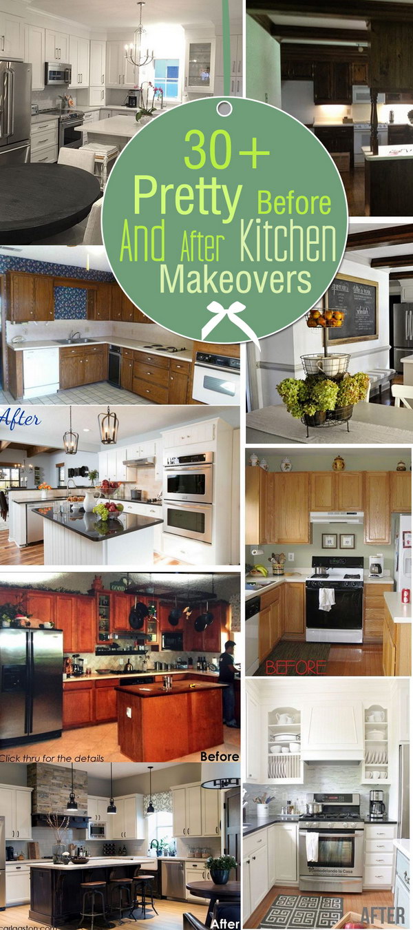
A renovated kitchen can deliver better storage, enhanced ergonomics and higher resale value. Get inspired by these amazing before and after kitchen makeovers and start planning a kitchen redo of your own.

Fantastic Kitchen Makeover: Same Cabinets with Creative Fixes
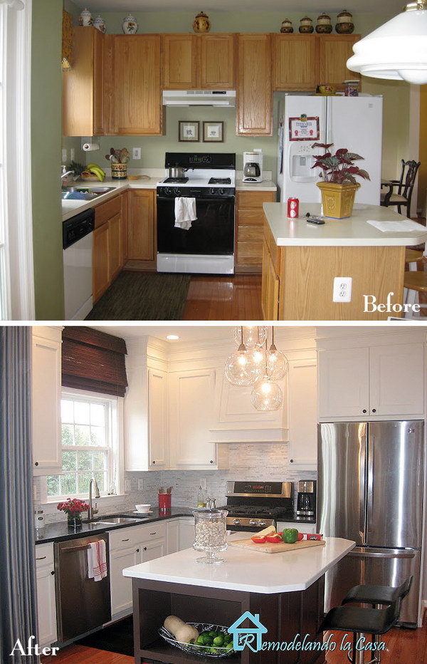

Before: Dark and Uninteresting. Not only do the laminate counters look drab but the dated appliance and lack of a backsplash made this kitchen a prime candidate for a makeover.
After: Airy and User-Friendly. The bland oak cabinets got an upgraded feel with trim work instantly brightening the room and adding to its height. The kitchen island also got a new color that blends in well with the wood flooring and enhances the chrome hardware.
Simple Kitchen Makeover with Painted Cabinets
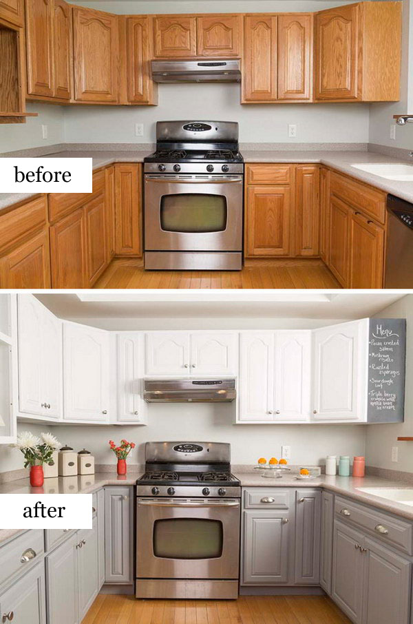

Before: Dated and Plain. Although everything seems neat and easily accessible in this kitchen, it lacks character.
After: A fresh coat of paint on the kitchen cabinets and the walls instantly transforms this space into a sleek and sophisticated cooking area. Notice how the two-tone look of the gray cabinets below and the white cabinets on the top add a stylish charm.
Before & After: A Kitchen is Totally Transformed with a Few Simple Steps
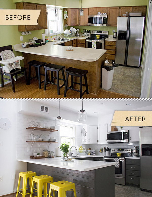

Before: Drab and Dull. The lower and top cabinets look bland against the yellow-green wall paint. Also, the flooring doesn’t blend in with the color scheme.
After: Clean and Modern. For just $9,000, this homeowner managed to pull off a new color scheme for the kitchen (white and gray). The splash of yellow beautifully breaks the monotony infusing a clean yet warm atmosphere.
Country Kitchen Remodelling: White Painted Cabinets + An Added Rustic Kitchen Island
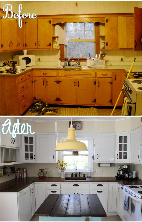

Before: Dull as Dishwater. Given the little amount of natural light that this kitchen gets, the cream and warm wood color palette only made it look smaller and uninteresting.
After: Bright and Beautiful. The white, cream and dark brown color scheme does wonders for this kitchen. Not only does it look more spacious than before, but the rustic island also adds flair and personality.
Kitchen Before & After: Paint + Backsplash + Light Fixtures = Whole New Look
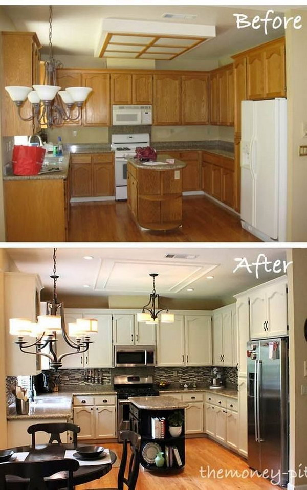

Before: Functional but Monotonous. Although this kitchen has ample space it could use a facelift to make it more modern and inviting.
After: Sleek and User-Friendly (Open Shelving). The dripping chandeliers definitely take the spotlight in this sleek kitchen. The black and white color scheme also lends a sophisticated look while complimenting the stainless steel hardware and the stunning backsplash.
Kitchen Before & After: Change Color Palette to Lighten up
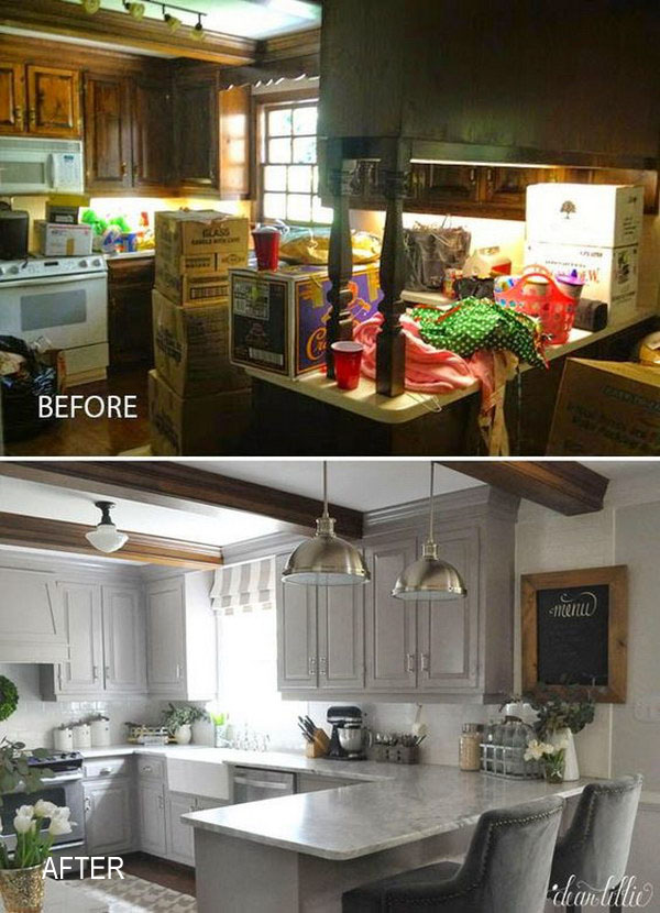

Before: Dreary and Cramped. This kitchen urgently needed three things: more light, more space and additional storage
After: Airy Elegance. The drab kitchen cabinets were coated in Benjamin Moore’s Winter Gate; a mid-tone gray paint with brown undertones instantly brightening up the room. White subway tiles were added for backsplash complimenting the apron sink and the brass fixtures.
Kitchen Cabinet Makeover Reveal
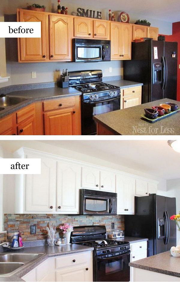

Before: Untapped potential. The black matte appliances look lifeless and out of place in this kitchen. Plus, there’s little natural light.
After: Beautiful and Efficient. The homeowner added crown molding to the cabinets and painted them crisp white for a regal atmosphere. An interesting stone backsplash was also added to compliment the black and white color scheme.
Before and After Kitchen Remodel
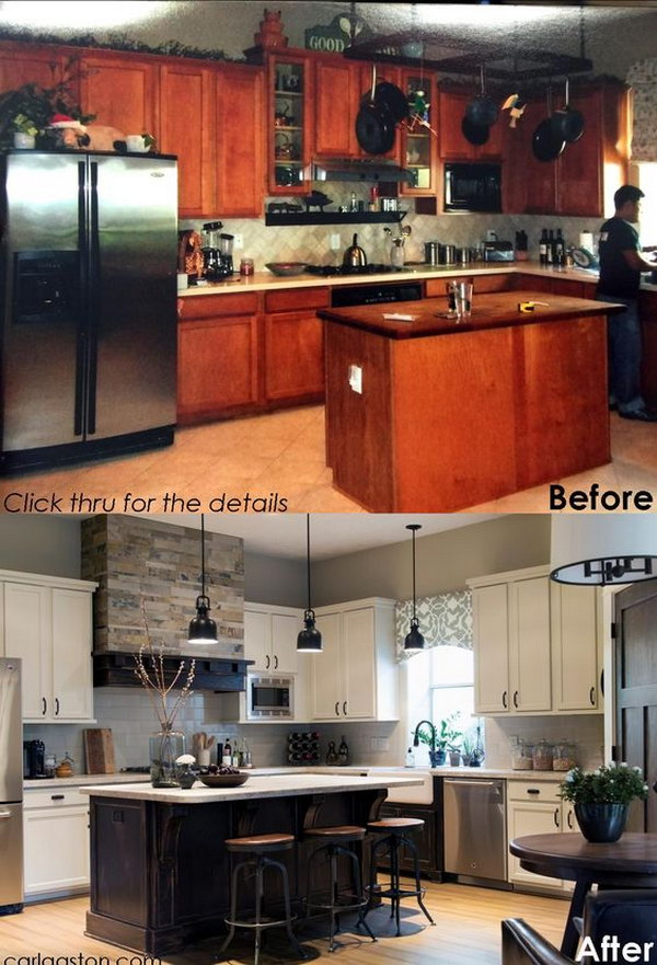

Before: Simple but Boring. This kitchen is begging for new appliances, stylish countertops and backsplash just to say the least. The orange wood cabinetry also feels drab.
After: Sleek and Modern. The new range draws your eyes up instantly making the room appear larger. The white and black color palette lends a clean and classy look to this kitchen with the matte subway tiles adding a unique touch.
Kitchen Before and After: From Dated to Chic and Modern
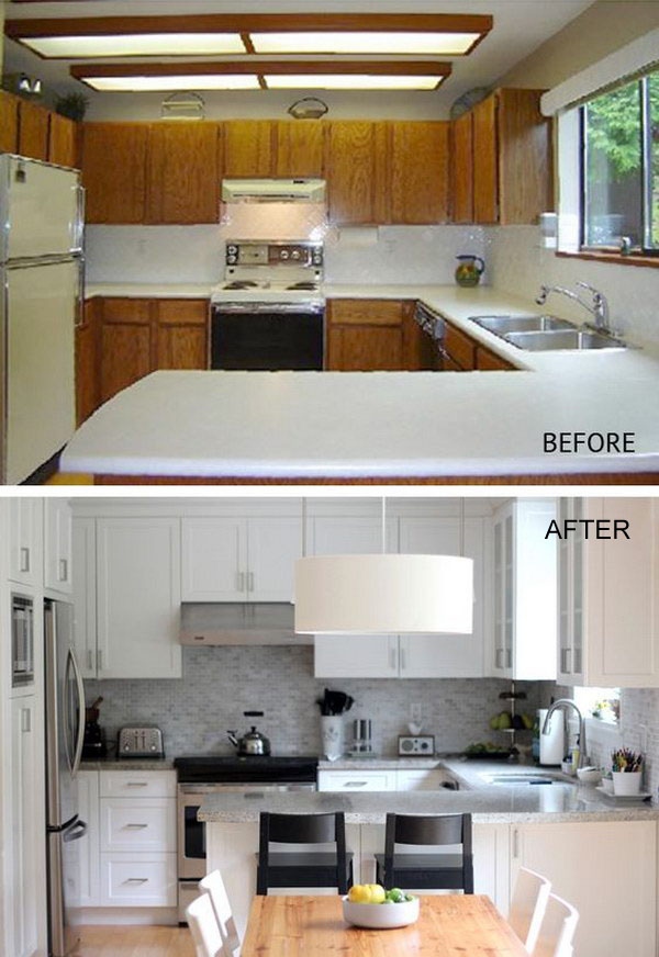

Before: Run-off-the-mill. Although this kitchen received ample natural light, the oak cabinetry doesn’t do any justice to the white countertop and brass hardware.
After: Bright and Inviting. The gray backsplash and white cabinetry blend well to create a clean and spacious kitchen. The black appliances and silver hardware add interest while the warm wood flooring anchors it all.
Sprucing Up the Kitchen with A Mini Makeover
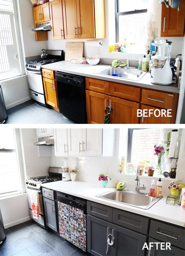

Before: Promising. Although this kitchen gets a lot of light and the white wall paint blends well with the wood cabinetry, there it still has potential.
After: Sweet and Clean. The homeowners got rid of the laminate countertop and replaced it with a simple white counter that blends seamlessly with the white subway tile backsplash. The two-tone cabinetry (white top and dark gray bottom) perfectly compliment the black appliances and chrome hardware.
Kitchen Before & After: Going Retro with Turquoise Cabinetry
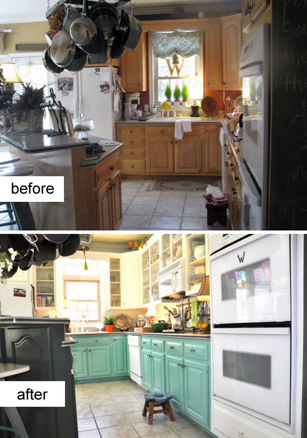

Before: Constricted and dated. The colors scheme in this kitchen isn’t making much of the natural light. It also lacks flair.
After: Fresh, Elegant yet Casual. The top cabinet doors were removed to create an open and inviting space while the bottom cabinets were painted in turquoise add have glassed knobs for a soft vintage vibe. Bookshelf lights have also been added over the open cabinets transforming the dull kitchen into an exquisite kitchen.
Kitchen Makeover With White Painted Cabinets
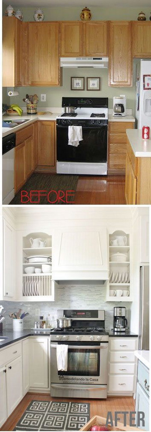

Before: Uninteresting. This kitchen lacks character plus the pottery displayed on the top cabinets is so last year.
After: Bright and Inviting. The homeowner used molding and trim to fill up space above the cabinetry making the room look larger. The white paint, open shelves and distinctive backsplash infuse this kitchen with the much-needed flair.
Kitchen Makeover on a Budget: Remodel Your Cabinets and Countertops with Paint for Under $200
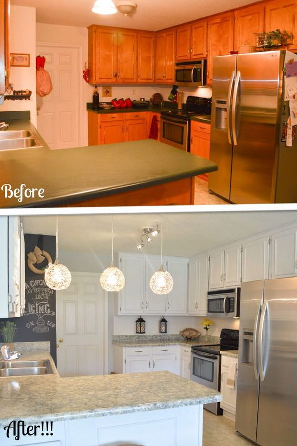

Before: Cute but Dated. The greenish countertop, the oak cabinetry, the white wall color and the pro-grade appliance do not complement each other.
After: Exciting and Spacious. For less than $200, this homeowner dramatically improved the look of this kitchen; a white and gray color palette beautifully accentuates the pro-grade appliances with the dripping chandeliers and slate countertop adding just the right touch of pizzazz.
Reveal of a Farmhouse Style Kitchen Makeover on a Budget
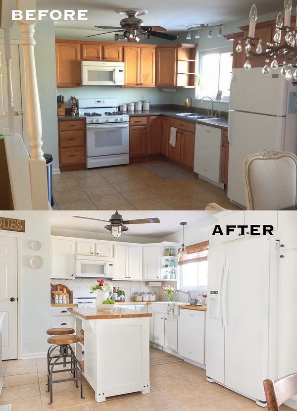

Before: Flat and Unimaginative. This farm house style kitchen looks old and dated; perhaps adding a touch of contemporary decor would do the trick.
After: Sleek yet Rustic. The homeowner decided to go for an all-white color palette with little whispers of warm wood. The bulky ceiling fan was also replaced with a more efficient and appealing outdoor ceiling fan and light. Lastly, the marble herringbone backsplash adds beautiful detail to this kitchen.
Before and After Kitchen Renovation with White & Gray Cabinets, Open Shelving, Subway Tile Backsplash, Quartz Countertops, And Layers Of Color
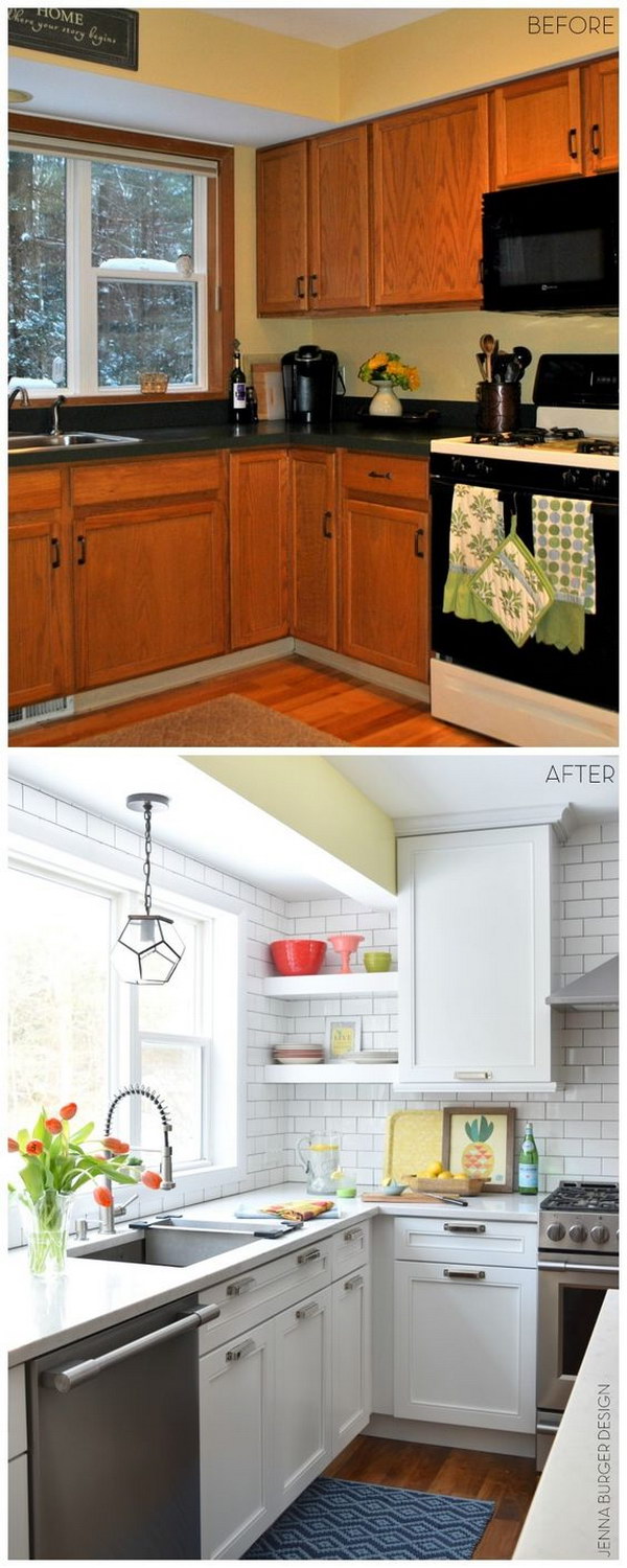

Before: The stark contrast of the dated oak cabinetry and the black matte appliances against a yellow wall made this kitchen anything but welcoming.
After: In place of the bland one-tone cabinets, the homeowner removed the cabinet doors on one end to add more depth to the area and create space for more colors. Continuing the white subway tile backsplash up the wall and behind the hood also worked to heighten the room while the quartz countertops effortlessly accentuated the white and gray cabinets.
Kitchen Makeover with Soapstone Counter Tops, Adelle Cabinets and Paint Color Change
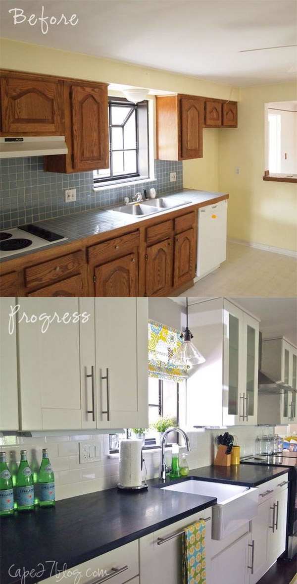

Before: Plain and Dated. The color scheme in this kitchen needs to be updated. Also, the space between the top cabinets and the ceiling create a constricting effect.
After: Open and Cheery. The upper and lower cabinets have been replaced with new stylish all-white cabinets that go up to the ceiling, instantly brightening up space. Crisp white subway tile backsplash has been installed all the way up serving to brighten and enlarge the space. The soapstone countertops and well-placed lighting do wonders for this kitchen.
Kitchen Remodel – From Dark and Dated to Bright and Beautiful
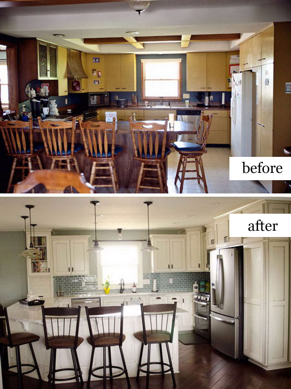

Before: Dark and Dated. This kitchen has tons of space but the finishes and decor are clearly outdated.
After: Bright and Beautiful. White cabinetry with charcoal glaze works to transform this kitchen into a clean and sleek space. The water glass tile backsplash also creates an interesting focal point.
Classic White Kitchen Makeovers
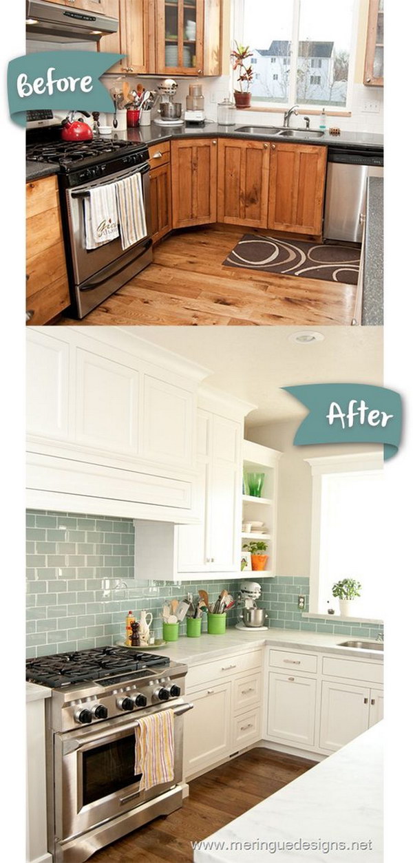

Before: Brown and Bland. Other than the fact that this kitchen looks small the color scheme isn’t helping much.
After: All White and Classy. Using white molding and paint extended the cabinetry all the way to the ceiling to create an airy and bright space and left the cabinet with one end open to create space for decorative pieces. The glass backsplash tile adds just enough flair.
Light and Bright Kitchen After Design Intervention
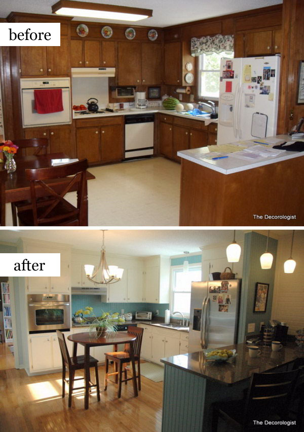

Before: Spacious but Underutilized. The dark wood cabinetry looks imposing rather than inviting. Also, the white-colored appliances and ceiling don’t blend in with the beige floor.
After: Light and Bright. The homeowner painted the cabinets white instantly creating a bright and airy space to prepare and enjoy meals. The added furniture also makes this kitchen more inviting.
Kitchen Cabinet Refinishing with Darker Paints
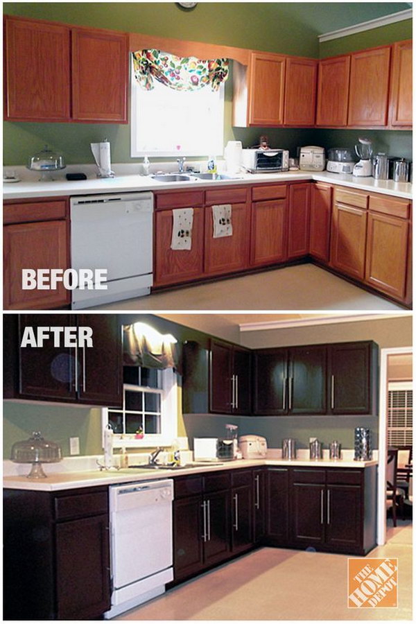

Before: Cute but Dated. Although this kitchen looked attractive, we can’t ignore the fact that the color palette feels drab and boring.
After: Modern and Sophisticated. The homeowner refinished the cabinetry in a darker paint that makes a bold sleek statement. To create visual interest, the homeowner also added touches of white and chrome.
Kitchen Reveal with Giani Countertop Kit Giveaway
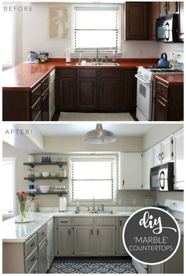

Before: Dark and Spooky. Although the kitchen receives lots of natural light, the color palette in the room is too dull.
After: Bright and Polished. The two-tone gray and white colored cabinetry makes this kitchen airy and bright with the faux white diamond granite countertops blending effortlessly into the color scheme.
“Fixer Upper” Kitchen Makeover
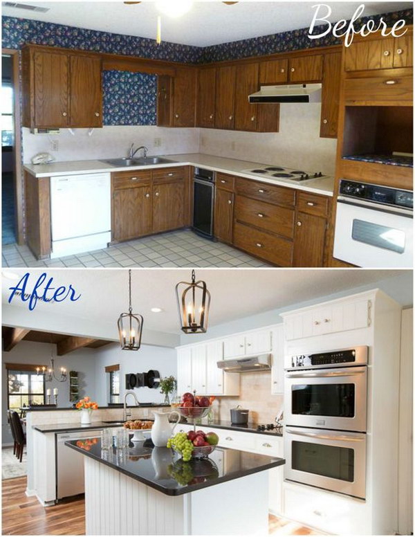

Before: Totally Outdated. Needless to say, the color scheme in this kitchen needed an update.
After: Sleek and Modern. All white cabinets contrast beautifully with the granite countertops to create visual interest. The pendant lighting and pro-grade appliances also led a modern touch to this kitchen space.
DIY White Painted Kitchen Cabinets Reveal
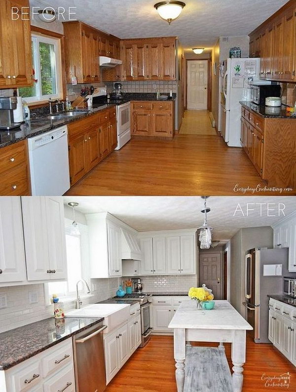

Before: Overwhelming and constricted. This kitchen is spacious, well-lit and sports a stunning ceiling design. However, the oak cabinetry and wood flooring feel constricting and overwhelming.
After: Bright and Crisp. The white island table, cabinetry and subway tile backsplash create a smooth flow with the wood flooring anchoring it all down. The dripping pendants add a nice touch.
Tiny Kitchen Renovation with Faux Painted Brick Backsplash and Wood Tile Floors
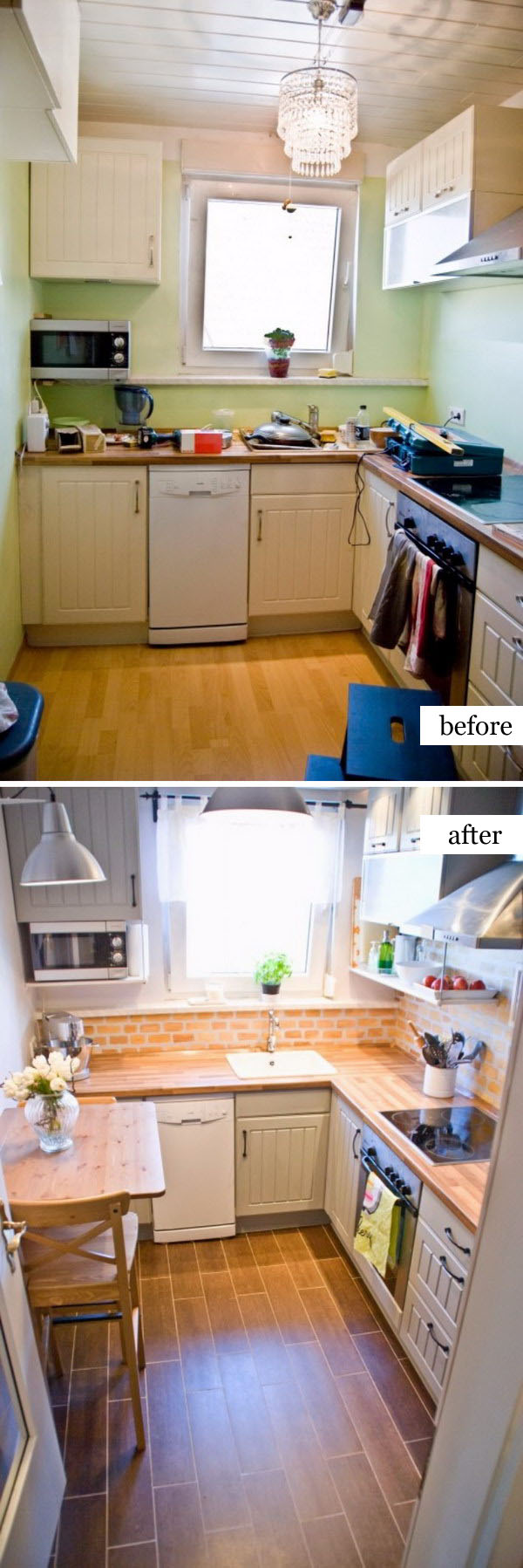

Before: Tiny and Uninspiring. The lime green wall paint and wood flooring make this kitchen look and feel even smaller than it is. There is also need for extra storage space.
After: Cute and Inviting. By painting the walls, raising the cabinetry and putting shelves underneath, the tiny kitchen has been transformed into a bright and functional space. The faux brick backsplash also adds personality.
Kitchen Updates on a Budget
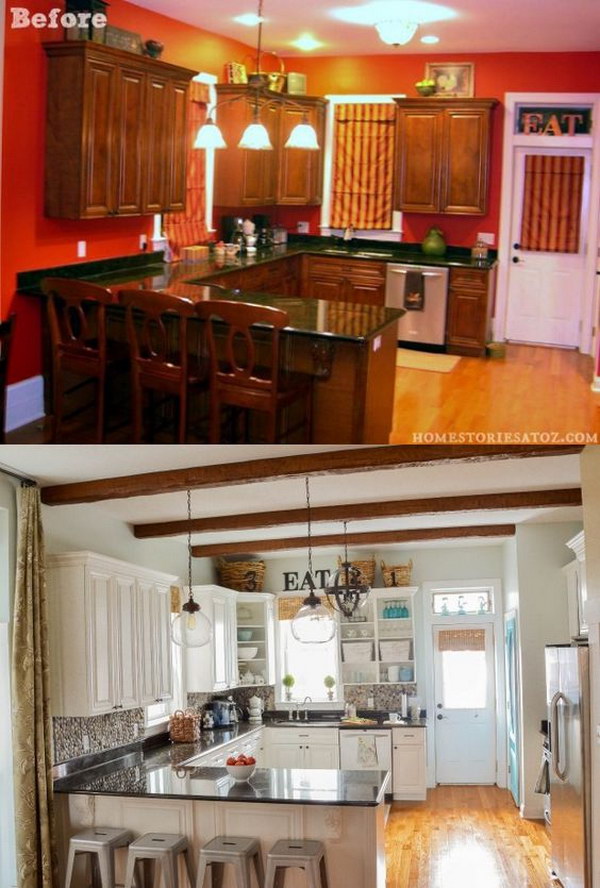

Before: Dark and Dated. The red color scheme makes this kitchen appear smaller and darker.
After: Bright and Expensive. The homeowner removed some of the cabinet doors and painted them white to create a bright and fun cottage-style kitchen space. Outdoor garden stone tiles are used for the backsplash, further adding to the farmhouse vibe.
Kitchen Makeover: Faux Granite Countertop and Bright White Painted Cabinets
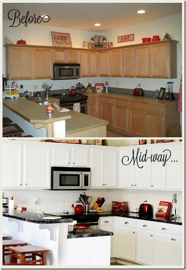

Before: No Character. This kitchen feels dull and plain. A new coat of paint and some splash of color should do it justice.
After: Fresh and Clean. The look of white cabinets with black granite lends an expensive and custom look to this kitchen. For character, the red appliances and chrome hardware blend well.
Stunning DIY Whiten and Gray Kitchen Makeover


Before: Dated and Tired. The color scheme doesn’t work for this kitchen. Plus, the chalkboard feels overwhelming.
After: Stunning and Modern. The two-tone cabinetry paint lends this kitchen a sophisticated and modern look. The upgraded appliances and chrome hardware also infuse a touch of glam.
Fixer Upper Inspired Kitchen Reveal
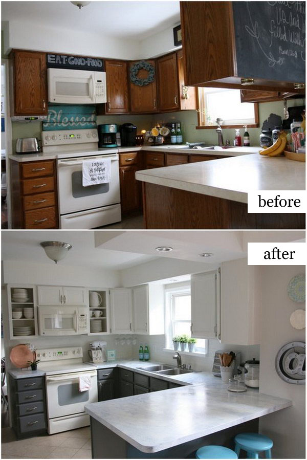

Before: Dull and Cramped. The dark wood cabinetry doesn’t make the space any brighter.
After: Chic and Contemporary. The two-tone cabinetry breaths life to this otherwise traditional-styled kitchen. The faux marble countertop accentuated the whispers of ocean blue on accessories and appliances.
White Kitchen Remodeling with Simple Steps
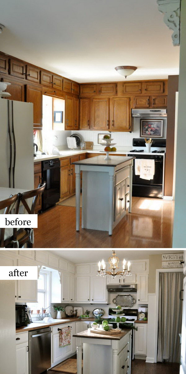

Before: Dated. The oak wood cabinetry overwhelms the matte black appliances.
After: Clean and Charming. The all white cabinetry and black hardware details draw attention to the sparkling chandelier; the floor anchors down the white on white color scheme while infusing some warmth.
From Galley to Glamorous: A Kitchen Before-and-After
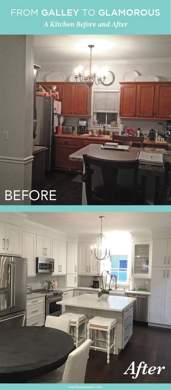

Before: Dull and Constricted. The oak cabinetry looks dull and dated against the chrome hardware.
After: Airy and Glamorous. The white color palette blends in effortlessly with the chrome appliance and hardware and draws attention to the elegant, ornate chandelier.
Kitchen Before & After: A Budget-friendly Choice
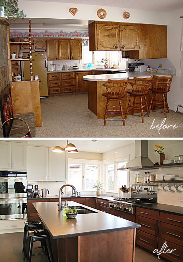

Before: Cute but Dated. This kitchen could sure use a more contemporary color palette.
After:The white and brown color scheme coupled with the open shelves work to create a bright and airy space.
Kitchen Makeover with An Oversized Chalkboard and Bench In the Kitchen
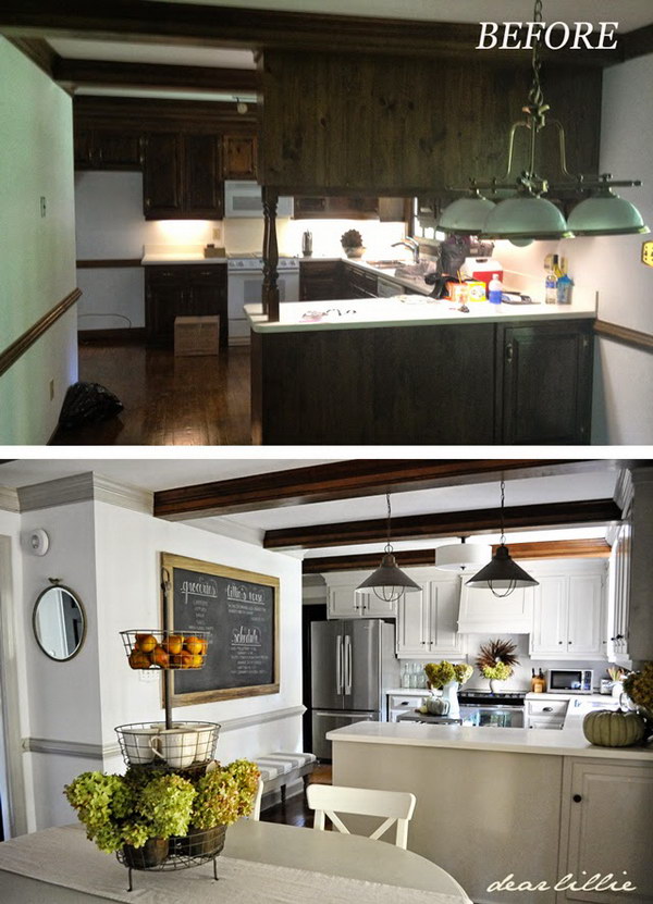

Before: Dark and Spooky. A brighter color palette will make this kitchen brighter; it could also use a touch of character.
After: The white and gray color palette adds depth to this kitchen with the oversized chalkboard and bench adding just enough flair to the decor.
